doubleTwist Holo - Alert


As people are struggling with the sweeping style changes on iOS, I figured I'd slightly document our move to a completely new visual language at doubleTwist.
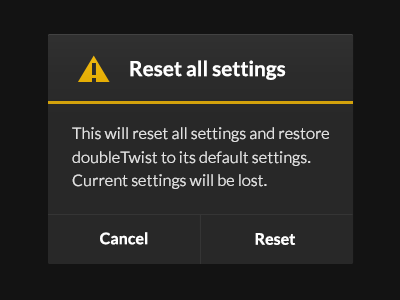
We're adapting from our old, fairly graphic-heavy style to a new, much more sparse style to fit in with the evolved 'Holo' aesthetic of Android. Our first release is but a basic adjustment, a very sweeping redesign is our next goal. I'll share steps of the design here as I go along.
With iOS' design being in such flux, it's a good moment to look back on the way Android's design has changed.
Android's first major redesign and attempt to find its own new visual identity was 'Holo', introduced with Honeycomb.
Honeycomb looked, for lack of a better word, pants-on-head ridiculous. A few people loved it, but c'mon. Look at that clock!
But in releasing Honeycomb, Google had made its first step to finding a new identity, visually. It was a brave new world, and over the next three and a half years they refined to the point where we now all recognize Google's style, and – dare I say it? – it has become beautiful.
One of the key things that eventually have Holo a soul was the re-introduction of slight effects, shadows, bevels, gradients - it came back to life.
User interfaces aren't dead. The subtle interactivity of iOS 7 reminds us of this so well: it moves with us, with the world, and its visual design should reflect the fact that it is more than just dead pixels. Slight details like these help that. I hope we'll see this aesthetic of iOS evolve like Android did.


