


iOS 7 Control Center Concept
Yet another iOS 7 concept.
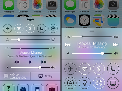
I think Control Center is the second important thing that should be redesigned (after Home Screen icons). Currenly it looks like some kind of a Cydia Store tweak.
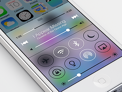
1. I clearly separated music from system stuff. If user not playing music at all we can simply hide music block from CC.
2. I removed Play/Pause button. I think we can use "tap on the song title" for that. When song is paused, the title will pulse. This tap is not really obvious from the first glance, but I think song title looks tappable, so user will discover that.
3. I've made song duration time in bold. It's really a pain to read a black Helvetica Neue Light in 12pt size.
4. I don't see a point to keep shortcuts to "Timer", "Calculator" and "Camera" apps there. If a person uses it a lot, they can put them into Dock.
5. Icons are now in unified style. Sliders are too.


