


Instagram iOs 7

Hey guys! Today I made a little exercise to understand iOs 7 better.
After it was announced two days ago I was trying to decide do I love it or hate it.
Of cause I agree about awful icons and some mistakes in UX. I dislike new command center because Apple made it just as people asked, but they could find better and simpler way to switch off bluetooth and wi-fi. I'm not sure if somebody need access to calculator and alarm from any screen. I don't.
There are a lot of things we can decry, but the most interesting thing for me is how world of iOs apps will look after few month. How new style of iOs will change apps that we use every day?
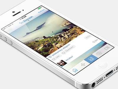
I decided not to wait for first updates and try how popular apps could look in new world. I didn't want to improve usability or change any functions. I wanted to try what will work with new visual language and what won't work. I wanted to feel where interface design will go in next few month (or years?).
That's what I realized working on this concept:
STYLE AND COLORS
I love new more content oriented style. Photos edge to edge, blurred bars. It will let us use whole screen more efficient and make bigger accent on a content.
I tried to use colours from current Instagram design - blue navigation bar and grey tab bar. It was possible , but I felt that it's wrong. white works much better with new design principles, it makes more sense of content. Of cause I'll continue to work with any colours, but I decided to use white here. I think making colourful but harmonious semitransparent interface will be my next experiment.
THIN FONTS
I think thin fonts without shadows would be a problem for people with poor eyesight and won't work on some cases. I used Helvetica Thin instead of Regular, I like how it looks but my mom won't appreciate it.
THIN ICONS
I just love them. I think they will add some freshness to our iPhones. At least for some time. I spent just a bit time to make or found these icons. It's just an exercise) But I'm sure I'll have a lot fun designing thin icons for my projects.
So, I think I like iOs 7. It has some issues, terrible icons and really cool new style that won't let us get bored for a long time!
Let me know what you think.


