iOS 7 Control Center Redesign

Today's iOS 7 announcement leaves me disappointed. On one hand I'm very excited about the direction the new design is going, on the other hand there are many design details that are just not there yet.
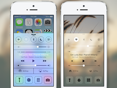
Besides the notorious new app icons, another piece of iOS 7 that makes me cringe whenever I look at it is the new Control Center (left). It's visually very noisy and feels very crowded, so tonight I took some time to re-imagine it a bit (right), leaving the layout alone for now and simply focusing on the visual treatments.
Don't forget to 2x for larger view and see attachment for full size.


