


iOS 7 ツ

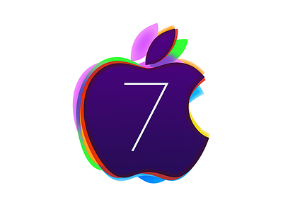
In anticipation of iOS 7, I thought it might be cool to experiment with a possible iOS launch icon.
I love the WWDC 2013 icon with it's terrific type concept and style, the hint towards colorful layered UI and information depth and reduced information entropy while maintaining context (blurred out backgrounds below overlays), and so much more.
While I like the bended "7" in the iOS banners, I prefer a simpler shape more consistent with the WWDC 2012 icon.
If you like it, share it :)


