Snapchat Redesign - iPhone UI


I've only just started playing with Snapchat recently—and yes, I know I'm behind the curve on that one. Anyway, today I saw the super-talented @James McDonald post a redesigned version of the app (which is beautiful, btw—you should check out his shot) and I got an itch to do the same!
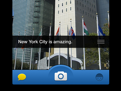
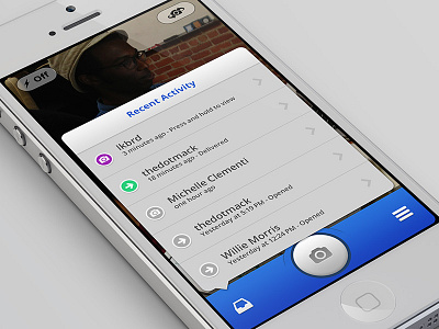
I think there's a missed opportunity with the current Snapchat UI—since everything is centered around the Camera, why not use popovers where appropriate rather than pushing users to another screen (only to have to navigate back to the camera again!)?! Anyway, not a huge difference, but I think it'd be a lot nicer.
Oh, the attached fullscreen shot shows the real pixels plus a "capturing" mode where I moved the progress bar and appended it to the tabbar.