Spark graphs

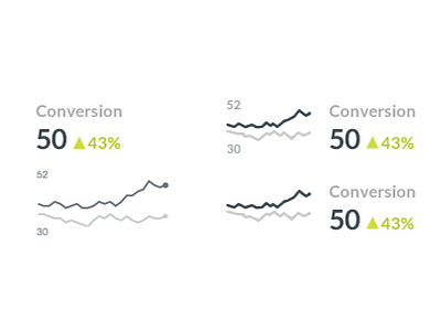
Designs for a dashboard UI. I'm leaning towards the bottom right, as the smaller numbers (while useful) tend to clutter up the info when you have more than one of these
Designs for a dashboard UI. I'm leaning towards the bottom right, as the smaller numbers (while useful) tend to clutter up the info when you have more than one of these


