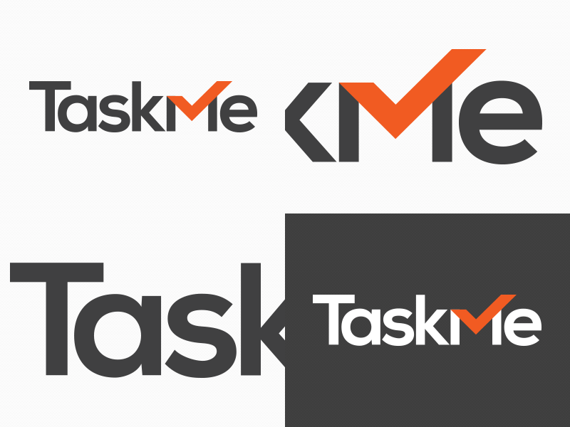
TaskMe Logo redesign
The original TaskMe logo was designed at a time when the app was in early stages. The logo redesign incorporates the classic 'tick' for a task application as we felt this would be needed somewhere as a visual cue for the user (even though we wanted to avoid this cliche).
The general feel of the logo also needed to convey the professional nature of the application's function so instead of a script font a serif has been used this time round.
All critique is welcome as I want to get this logo perfect... Next up is the icon which will be simplified from its current state.
More by Ben Dixon View profile
Like


