Easy Care Gardening Logo

Mockup I showed the client together with the 'flat' design: http://cl.ly/image/0Z342H3o1U3E
Easy Care Gardening (ECG) is a charity organisation that provides gardening and lawn mowing services to the frail, aged pensioners, carers, and the disabled with the aim of helping them stay in their homes longer.
The client felt their existing logo was outdated and was proving quite difficult to use in publications and on the web given its dimensions. Instead, they wanted a logo with a fresh, new look that appeals to the younger generation (who they see as their future volunteers). They wanted the logo mark to be simple and easily applied to a range of mediums, including embroidery for staff uniforms. They wanted to avoid "sludgy browns" and "murky greens". They also wanted to project a feeling of nurturing and protection in the design itself.
The way I saw it, ECG is fighting a battle on two fronts - one to provide a gardening service to the elderly and disabled so they can stay in their homes, and the other to attract volunteers to provide those services. To appeal to the younger demographic (i.e. the future volunteers) I used a clean, fresh, contemporary design for the logo. To appeal to the elderly and their families, I took to colour theory and chose a dark blue and green-blue scheme that projects the feeling of credibility, reliability, trustworthiness and commitment, and I included a leaf in the design to represent the garden services ECG provides.
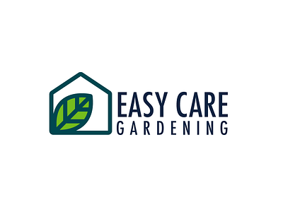
The logo mark consists of a leaf being encompassed within a house. As standalone elements, the leaf and the house illustrate that ECG provide gardening services at people’s homes. The squareness of the house suggests security, honesty and stability, while the organic shape of the leaf is comforting and interesting, instantly telling of the type of business ECG runs. When viewed as a single element though, the logo mark gives off a secure, safe feeling as the house hugs the leaf, helping project the nurturing feeling ECG wants to portray to its market.
Turning the leaf on an angle gives the design a dynamic kick and it serves the purpose of drawing the viewer’s eye to the text of the logo - the business name.
The outlines that make up the logo mark are carried through and reflected in the ECG text, which helps bring harmony, continuity and balance to the design. By using a sans-serif typeface for this text, the logo takes on a contemporary feel and encourages the viewer to read the text and see the design as a whole.
By keeping the design simple, it becomes scalable to almost any size and it retains its power in colour, as white on black and as black on white. As people become familiar with the new brand, there is potential for the logo mark to be used by itself with people still knowing the company behind it.
The client is delighted, and I'm glad I could help this worthy cause.


