


Otis & Sons - Branding 2

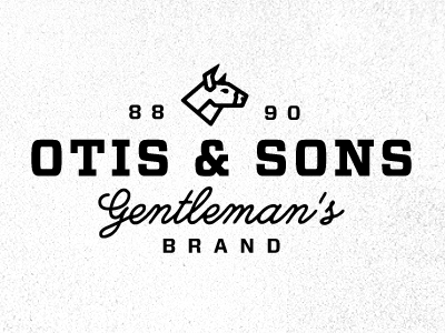
Update on a shot from yesterday. I wasn't very happy with the Ox from the beginning and others seemed to agree. Not sure if this helps counter balance the script below the type better.
So any input would help on if this Ox is working better or to ditch the mascot all together.
Also played with a script version just for fun.


