


The new hierarchy design

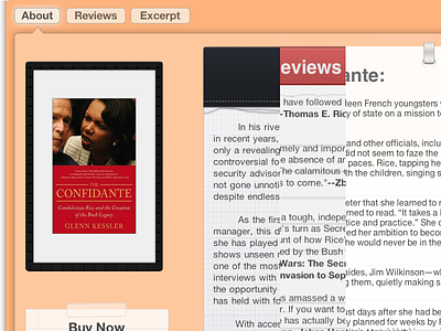
So, in 2.0, I am trying to fundamentally improve the reading experience of GlennKessler.com by focusing the reading content on one side and the other options on the other. That makes it easy to see what to read as soon as the page loads. So I have a paper graphic on one side with the reading part of the page, and the other side has the book cover and a buy now box. This separates the sections cleanly and clearly. So when you click on the navigation buttons (About, Reviews, and Excerpt), the cover and buy now button stay in the exact place but the graphic and text change (as this image tries to show you--each of the three graphics for the three pages). Little side note, when you click on About, Reviews, or Excerpt in 2.0, the page loads instantly--no reloading, so the effect is more pronounced makes it clear that you are still in the same section. What do you think?


