Gmail Logo Refinements

Here's a set of proposed refinements to the Gmail logo. On the left, is the original logo. In the middle, is the one used in the iOS Gmail app. The one on the right is my favorite, but it was too difficult to push through.
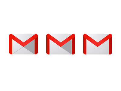
Here's a set of proposed refinements to the Gmail logo. On the left, is the original logo. In the middle, is the one used in the iOS Gmail app. The one on the right is my favorite, but it was too difficult to push through.


