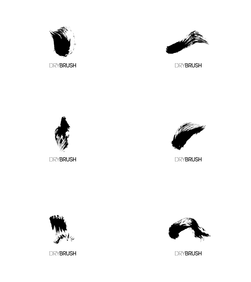
DryBrush Logo
This is just a logo concept that resulted from my playing around with a waterbrush filled with black ink. My initial plan with that brush didn't go very well but it did result in some quite lovely strokes that I thought were worth taking further.
So I scanned them, did some level adjustments in Photoshop, then took them into Illustrator and vectorized them using the trace option because I wanted them to still look quite realistic. And at this scale they do. And then I immediately started making pictures in my head about a very straight-forward art supply store called "DryBrush" and could make the symbol of the logo an actual dry brush stroke. And made a gif because I couldn't really decide which stroke is better. Well, I do have 1 or 2 favorites, but I thought it looks interesting like this.
I might take it further. Or not. I don't want to do YET ANOTHER black&white identity, but then, I can't see this in any color either. And rainbow-colored-logos are so last year!
If you're still with me after all the blabbing, please do give some feedback. Or chip in with some ideas. Or rebounds. Or we could make a just-for-fun project and collaborate! I so long to do a collaboration for a change!


