Kiubi process

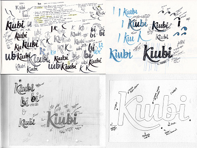

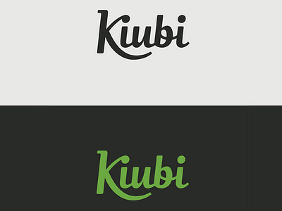
A few sketchbook pages from a recently finished logo redesign for Kiubi, a CMS and e-commerce platform based in France. Bigger image and final vector attached.
The aim was a clean, contemporary script with a controlled, sturdy and even feel, without being too heavy. It also had to mark some kind of continuity with the existing logo as it had been in use for a couple of years (the prominent 'K', its little serif and the green being the main contributing factors).
There are also some screenshots of the upcoming new interface with the logo in context on the founding company's blog.
(Thanks to @Danielle Evans and @Adam Trageser for the extra motivation to get round to posting something!)


