


Logo Explore #4b
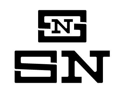
Extended the S to be as wide as the N (top example) but it looked awkward and unbalanced when placed side by side (bottom example). However I revisited the old monogram style and think it works really well. The N isn't as over powered as it was in the first iteration, IMO.
The S in the bottom example is just a few pixels thinner than the N but the balance feels right.


