Nixon Redesign for Fun


Thank you everyone for the support from the preview I posted–that caught me way off guard, and for sure helped motivate me to finish this thing up quickly.
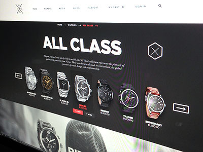
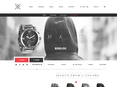
So this is only the redesign of Nixon's product detail page, with a couple of global interactions baked in. The main concept I wanted to execute on was having the product scroll down with you– with all relevant actions tracking with you as well to help drive conversions. Conceptually it is very basic, but the execution took quite a while to nail down to look respectable. The one big condition (of many) I wanted to consider was that the fold is sadly real. That being said, all important content lives within a (slightly generous) 700px window as you scroll down the page, with anchor links and global nav abilities tagging along as well. The nav would also lock into place at the beginning of each section (which is simulated HERE).
There's a few other states/interactions attached as well– there's more, but dribbble limits to 5 attachments.
With regards to branding, I got some comments on the preview that it looked nice, but definitely didn't 'look like Nixon.' I agree– Nixon now as a brand is in a fairly different place than what I'm portraying. I started this just before their current site launched, and built it as an evolution from the style then. In the end, I tried to walk a line of evolving from their previous branding while adding accents of the existing brand. I also wanted to keep their emphasis on flat, but embrace white space over the modular editorial approach they currently have.
I think I'll eventually make a movie out of this show it in action– but that won't happen until the new iMac comes in. Oh, and this has zero affiliation with Nixon. 100% for fun + creative exercise. **
Of course, follow me for updates.