Responsive Natwest Redesign (Retina)

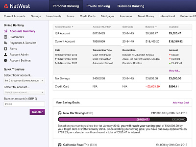

I've been redesigning part of Natwest's online banking site in my spare time. It's a site I visit most days, and although their current design could be worse, there's a lot of room for improvement. It isn't full width (it's aligned to the left with a big white panel on the right) nor is it fun or responsive... and let's face it, banking needs to be made as fun as possible to make it feel less like a chore!
There are no new feature ideas incorporated into this design, it is purely a fun redesign using a similar layout and colours. I felt it should stay pretty professional considering this is a real-life bank!
Would love to hear your feedback, especially those of you who bank with Natwest! You can view retina pixels and the wireframe I put together prior to designing this.


