W&H Redux

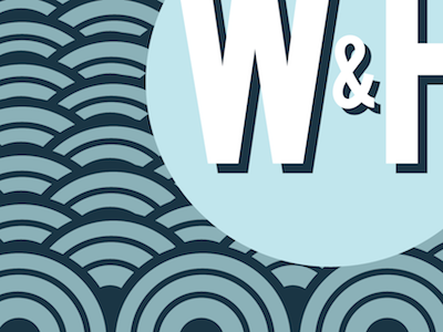
Gone back to the drawing board for the W&H logo, but it's for the better! They wanted something a little more contemporary and to use their website colours, so I'm trying out a bunch of new ideas to see what works best for them.
Gone back to the drawing board for the W&H logo, but it's for the better! They wanted something a little more contemporary and to use their website colours, so I'm trying out a bunch of new ideas to see what works best for them.


