Simple + Time + UX

I love Simple.com to death. Best banking experience I've ever had.
But... this one little thing really bothers me.
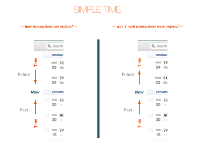
In the transactions list, time moves in *two different directions*. On the left, scheduled transactions are in ascending order, while completed and pending transactions are in descending order.
On the right, I've put time back in order. What do you think, Dribbble?


