


Status icons


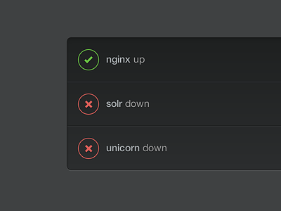
Another aspect of the new look include clearer status icons. Previously we just used solid green or red dots, which didn't work so well for folks with colorblindness. This has the benefit of explicitness and it looks pretty damn cool.
Another aspect of the new look include clearer status icons. Previously we just used solid green or red dots, which didn't work so well for folks with colorblindness. This has the benefit of explicitness and it looks pretty damn cool.


