


Já Redesign (Mobile Version)

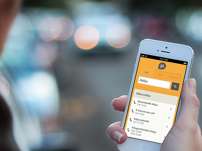
Here's the mobile version of the Já. Being a responsive website you get the same content as in the version for larger screens (seen here: http://drbl.in/gKHl) but the focus has changed a bit. One example is how each cell in the results becomes a call button with the option to see further information on the right.
Be sure to check out the full pixel attachments.


