NAA Logo Design


Been a while since I have been able to post anything of note on dribbble due to being incredibly busy with some hefty client logo projects over the last few months.
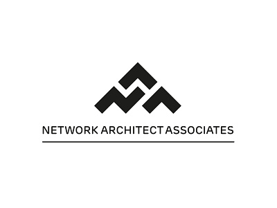
One of these logo design projects is for NAA: Network Architect Associates, which is almost complete. We are just finalising smaller details like: type size, spacing, proportions and brand colours, but the actual logo mark design itself is complete.
Yes indeed, the logo mark is a representation of the companies initials forming a pretty solid, and identifiable brand mark in it’s own right. This design isn’t meant to be a straightforward typographic mark, but more of a semi abstract, highly stylised representation of the initials. It doesn’t particularly matter if people don’t see the NAA initially, or even at all, but for those that do it should end up being a memorably mark.
I choose this direction because the full company name is somewhat long, and the client had stated early on that the logo design ought to focus on the initials in preference to the whole three word brand.
For those of you looking to find meaning in the logo mark design, there are a few nice ones:
• I like the appearance of this pyramid, a period where all all the amazing architectural developments were made brick by brick. That a pyramid is enduring, captures our imagination, gives impression of complexity made to look ‘simple’, that we have interlocking pieces that build the NAA brand from the ground-up all whilst showing a upwards and onwards positivity. Building, designing and forming.
• My client did serve in the USAF, and he did mention that he wanted his brand to, “To capture the “energy” of our group, I use the military special forces as an analogy. I’d say my team is like the SAS of networking–highly specialized, talented, fast, young, and aggressive.” Early on in the logo designs development it seemed to take on the shape of a stealthy B2 Bomber which forms a bit of a personal bond to the brand for the client.
• This is a company that wants to be seen as relatively aggressive in a ‘getting things done’ way,
• Conveniently there are 3 partners in the company which are represented by each part of the logo marks structure.
So there we have it for now. A quick overview of my latest logo design project with a full logo developmental process post to come at some undetermined time in the future.


