iPad typography
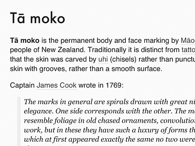
Had been dying to use Futura in a project and also wanted to experiment with iOS development so I made a single Wikipedia iPad app (see mathewsanders.com/wikipedia-ipad-app for more).
A friend that I respect once told me (and continues to remind me) not to use so many fonts, but I think Futura is a beautiful heading font, Helvetica works great as a neutral and Georgia looks amazing as an italic. The three make a great combination... at least I think so :)
More by Mathew Sanders View profile
Like


