Instagram Redesign

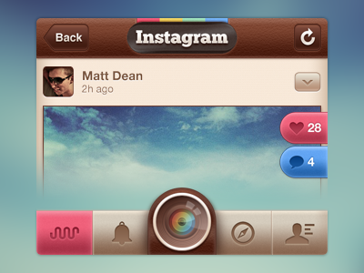

I've always wondered why Instagram never designed an interface using the colors, textures and overall style of their awesome icon. I wanted to create something that not only matched the icon's style, but that did what the icon does, which is give the app character and personality.
Design/shot notes: The bottom bar buttons select states correspond to the 4 Instagram colors. Also, the like and comment buttons would not be pink/blue by default, instead only if you had liked the photo or were actively engaged in commenting on it.
Let me know what you think, I'd love some feedback!


