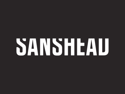
Sanshead Logotype
Sanshead is a collective of filmmakers battling to build a strong filmmaking community stretching across the rockies. The identity created not only draws from the organization’s name but also it’s mission, by embracing the horizontal. It’s strength comes from adaptability and adoptability. Sanshead’s literal translation, without a head, is highlighted by the slight angular cuts on the corners of each letter form contrasted by the sharp removal of the top of the mark.
View all tags
Posted on
Sep 29, 2012
More by Bobby Biskupiak View profile
Like


