


Rigamajig Wine
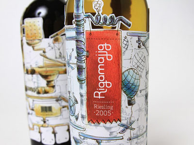
When concepting on this design, I was pulled to the art of wine making. This wine label highlights the process of making wine. The concept is based off of the idea of a Rube Goldberg machine. Throughout the illustration, the process is unfolded, showing how the grapes are crushed, filtered, and stored for aging.
If you image the first stage in the wine making, the grape, dropping down into the neck of the bottle then, you can see the bottle as a machine itself in the follwing steps portrayed. The grape is processed into wine in the machine, to fill up the bottle up which is portrayed with the die cut splashes at the bottom of the label.
To view more, visit www.ampersandidesign.com


