Final logo design

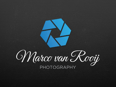

So, this is the real final design of the logotype. I wanted to keep the aperture, because that's a part that says a lot about photography. I discussed the part with the client about the last logo being to similar to Picasa, thanks to
@Jari Sanders , I should have known better :)!
I added a file to the logotype where you can see it on black and white with the logotype above and next to it!
This is the final, client's happy and so am I! Hope you like it too!