Logo Process

I'd love to hear everyone's reactions to these.
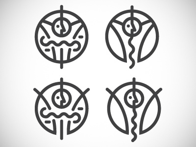
I'm working on a satirical branding project for a company that helps people lose weight through the use of tapeworms. Kind of a strange project but I'm excited about it.
I'm exploring a couple different variations of forms here. The top two with the arms being held back behind the head give a trapped kind of feel to them, while the bottom two are more celebratory. The two left options use the tapeworm form to tighten in the stomach, while the options on the right show more of the relationship of the tapeworm and the digestive tract. I'm not sure if I want to keep everything mono-width or have some lines tighten up in some places either.
Hit me up with some feedback, I'd really appreciate it!


