Fyd Logo_v6

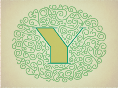
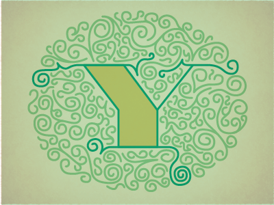
I am much happier with this'Y'. I was trying to blend it before, but also have it stand out. Not sure that even makes sense. I think I am getting pretty close, definitely need to tighten up all the little flourishes and check spacing on all of them. But would love some feedback on this before it goes to the client one last time.
cheers_