


Skeuomorphic UI tip

In skeuomorphic designs, there is a practice of adding tiny bumps as detail on sliders, window edges etc. This is added to suggest to the user that it is a surface which gives a grip and hence a drag interaction on that surface is possible. Some of us get it right and some of us, sometimes forget to think a little bit ahead. Here are a few examples from Dribbble with this detail done wrong :
[1] [2] [3] .
Download the Interactive Demo
Here is what has gone wrong in the previous shots :
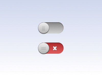
The Right Way
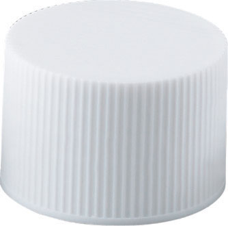
The bumps on the first knob are vertical in orientation. This type bump pattern in real life will help the finger to grip to the surface. This makes dragging or sliding on that surface easier and more convenient. You can notice such types of grips being used on the sides of the bottle caps
The Wrong Way
Now, check out the second slider. Here, the orientation of the bumps are horizontal and for a horizontal motion they provide very less friction compared to the vertical ones. Also, there is a chance that it might prompt the user to do a vertical slide instead of the horizontal one. If you try to slide a knob with this type of bumps, our hand will move smoothly across the button rather than gripping to the toggle and dragging it. This should be used in a vertical slider where this grip pattern is apt to provide enough friction.
In my opinion you should get the skeuomorphism right by giving attention to such tiny details. When you port something from real life to the digital screen, don't forget its real use :)
Built upon the iOS module by Prathyush Pramod.


