


Logotype

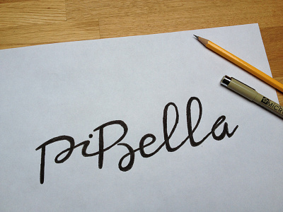
Rough sketch of an hand written logotype I'm working on. I think the "i" is a little bit off and needs to be slightly rotated. What do you think?
They sell unique and one of a kind handmade dog/cat collars. So I went for an elegant and connected look and feel.
How does it read?


