


I've toyed with creating custom Google home pages in the past, but I woke up today with this idea.
Today, Google keeps a clean focus on textual input for their search home page. And that's great. But as our screens get larger, the more white space doesn't say "clean" to me, it says "missing." And as a stereotypical designer, I love my white space, so it takes a lot for me to come to that conclusion.
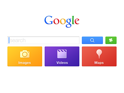
I started by moving the gray search buttons from beneath the field to beside it. I also increased the size of the field and buttons and colored the search button blue as it is on the results page.
The "I'm Feeling Lucky" button has long been a part of Google's history, but it rarely seems useful to me, as the ambiguity kills usability. Here, I'm calling more attention to itself by making it green and giving it a cute four-leaf clover icon. After you've entered a search term, if you were to hover over this green button, you'd see a tooltip/popover with familiar web search result layout version of where that button would take you. It takes the guessing out of the button. And while it may seem less "lucky" it does provide new useful scenarios.
In my opinion, I rarely use realtime search suggestions. While they are home to many jokes when you form a question (and it completing it), I don't find much use for it. For instance, if you were searching for iPhone 5 cases, and you start typing "iPhone 5," what use is arrowing down four times to "cases" instead of just typing it? Your attention is drawn to the list of suggestions instead of completing the search term you already had in your head. (I understand that some people, sometimes including myself, use it as a quick assistant for spelling.) So while you type, you get zero suggestions beneath the field itself.
There are three large, brightly colored tiles beneath the search field for Images, Videos, and Maps. (While arguably News is another search-friendly section of the site, I chose to omit it.) These three result types are most common for at least me, enough to warrant some easy access to the results that might come up from it.
Of course, simply hitting "return" or "enter" after typing your result will take you to the familiar web results page. But after you finish typing a search query, the Images, Videos, and Maps tiles become live and show an image mosaic, a video grid, and a map (if applicable).
If you're searching for a restaurant, you'd see images, perhaps some video, and a map of where it's located. If you're searching for iPhone cases, you'd see some images, video reviews, and maybe a map of where to buy them. If you're planning a super awesome funtime adventure vacation to Disneyland, you would see fantastic images of the park, videos of ride-throughs, and a map of where the park is. Pretty cool, I think.
EDIT: Oh! I forgot to mention. Without typing anything, clicking on those large tiles would take you to interesting images from today (could be news related even!), most popular videos today (from YouTube?), and a map of where you are now. END EDIT.
Be sure to check out the three attachments which show all of these ideas and a slightly modified header and footer too.
Of course I should note that I don't know any of Google's statistics or anything about what makes Google's home page best for everyone, but this redesign is based on my own experience of what I'd like to see while searching for things.
By all means, post constructive criticism, other crazy ideas, rebounds or whatever! Don't post rude comments. Don't be mean to other people. And yes, I've heard the "unfinished" joke about 50 times now. Keep it to yourself.


