


iTunes Menu

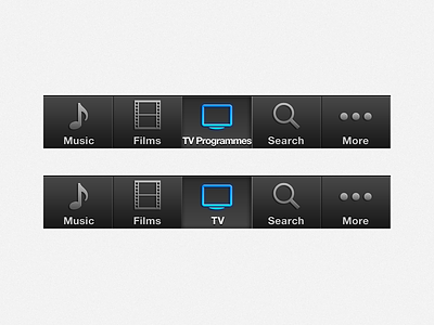
So i never really open iTunes on my iPhone or iPad, but today i had a little look and wondered why the TV Programmes button was so different.
The text horizontal spacing was reduced to -50 and the label was edge to edge on the button bg which isn't that nice.
Surely the label can be simplified right? so i decided to mock up and change the label to TV which looks nicer and fits better within the space provided :)


