Wacom (re)brand

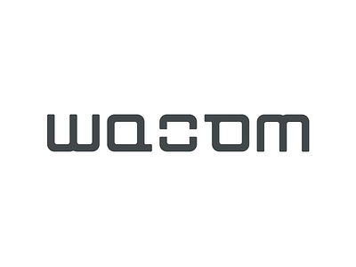

So I saw that @Alen Type08 Pavlovic started a new playoff with rebranding big and famous global companies and I thought it was a good opportunity to show the world that I don't like the Wacom logo =)) That's right, I literally hate it when I see that logo on my intuos4, I don't know if that thingy is something very significant for Wacom, but I saw that on the most of their products they only use the typo. The symbol just doesn't fit the brand's big name and the greatness and quality of the product, so I tried to redesign it. I've chosen to go with an ambigram because the logo is also printed upside down on the tablet...so...why not?
Also, don't forget to check out the attachment if you want to see a slightly second different version of this! Cheerio!