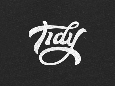
Tidy - Logotype
Tidy is brand-new UK based agency which has 2-sides to the company, one is a consultancy agency focusing on Usability, User Experience & User Interface Design. The other is focused on research & development of new digital products.
The word Tidy is used in wales to describe something as cool or used a positive response.
The expert guys approached me for a cool & fun logo, as they want to show simplicity and responsibility, but also come across as cool, fun, cultured, and easy going.
But they are also big fans of calligraphy, typography and hand-made type stuff as well.
Client chose this version over the other 'open letter d' version from a usability point of view.
Have a great weekend to ya'll!
More by Gert van Duinen View profile
Like


