


Selfservice Logosheet

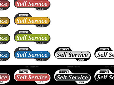
This is an excerpt from a logo sheet I created for an internal application that we're working on rolling out here at ESPN. We had gone back and forth on a number of items, but eventually nailed it down to this general shape. The final bit was the color. After a bit of debate, I pointed out that there was no reason we couldn't keep all four of the colors that were used here. Just pick the color that best seems to work with the use.
The gradient in the color and black and white logos is the official 'rich' logo, while the flat colors are supposed to be used for limited-color print situations, embroidery, etc.
However, after having it around for a little bit, I get the feeling that the gradient versions may go away altogether and only the flat designs will remain. I wonder if a favorite color will present itself over time, as well.


