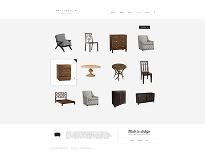
Real Pixels Alternate
I really like the first one for the effect that the white background has on the hover state and how it does a great job of highlighting the thumbnail. I also really like the second one for the way that the underline pulls in a design element that seems to be used throughout. I just wanted to see what it would look like to combine both of those. I didn't think that the corner plus was needed. I really liked the simplicity of the second one with just the border-bottom. Great work as always.