


Sydney Harbour Dental

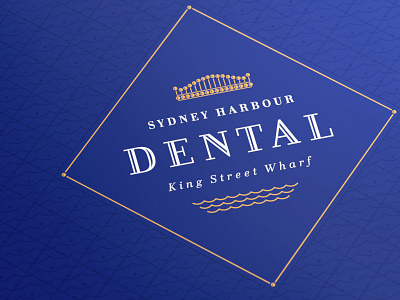
A logo and identity I'm working on for another dental client of mine. This time a more high brow approach given the location of the practice. The mark is meant to be a visual representation of a kings crown and the Sydney Harbour Bridge made up of 32 pearly whites (now gold). Early stages.


