Amazon Mobile Website Concept 4

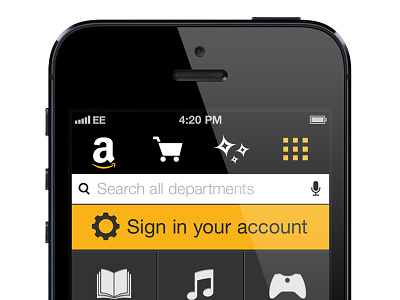

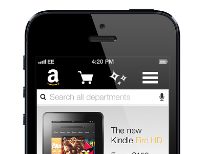
Probably my last attempt at this concept. After further feedback I decided to remove the scrolling departments at the bottom in favour of re-introducing the department tiles, which is revealed when the menu icon is tapped. This gives the featured products extra white space, but retains the 'recommended for you' feature, which I think would be really useful.
Check out the attachment to see how the home screen would present more than one featured product and a full shot of the tiles in action.