Font - Lowercase Sketch

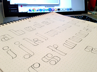

So I finished my first draft of lowercase letters and REALLY would like some feedback and critiquing. See the attached file...
There are some things I like and a few things I don't know if I like, but I wanted to get a fresh pair of eyes on it. Here are some main points I would like to ask about...
1) Do you think the ascenders (I think that's what they're called) should come up higher above the dots of the i and j?
2) x was by far the hardest one to come up with while maintaining this style. I don't know if it's quite there, yet, but I feel like I'm out of ideas. Any thoughts?
Anything else you would like to express, I'm totally open to hear it. I think that's it for now.


