


Esquina - Draft

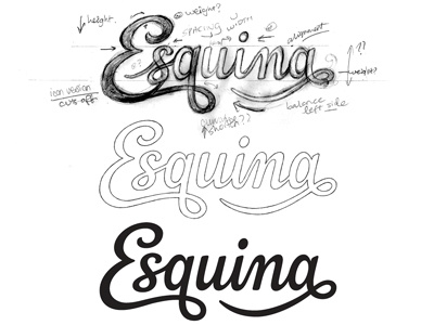

Logo I'm working on for an upcoming project by @Don Ramón. Overall, I was going for a mid-weight script with a good natural flow and a distinctive touch. The top one is the initial (very) rough draft, the middle is the final concept sketch and the bottom one is the first vector draft. So far, the lower junction of the 'a' bowl is too thin which is giving it a weird angle so I'll be adjusting that, but curious to hear any other feedback or suggestions.
Full view attached.


