Resolved Toolbar Icons

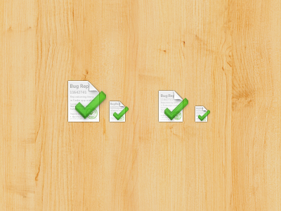
The document icon took some inspiration from OS X's document icon.
The checkmark took some inspiration from Jesse's shot: http://dribbble.com/shots/28325-Check-Icon
I'm still unsure if the "3D" checkmark was a good idea for a toolbar icon, it makes it look weird and a bit blurry. I think it would probably look better from a straight-on perspective. I may even make the document icon a bit flatter as well (the page curl).


