


Mostly Serious Mobile Landing Page

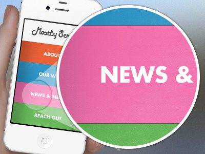

I finally finished the website redesign for Mostly Serious but instead of making the site responsive down to the mobile level, I opted to go with a separate, but fairly similar, mobile site design. The focus of the mobile site is to give extremely easy access to the different areas of the website—so, naturally, I made four gigantic fucking buttons to get to the interior pages. From there, the navigation will be much like an iOS app, where users will go back to this screen to access the others pages. The one exception is an ever-present email button in the top right of each screen.
Thanks to Marshall for the iPhone template, and Mike Hall for the hand holding it.
And, if you'd like, you may follow me on Twitter, because I guess we're doing that now.


