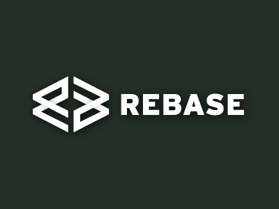
Rebase Logo Update V2
Putting the previous "node" idea to the side for the moment as it's proving a little too tricky to tame, so time to look at some other options to keep my brain motivated.
Starting off Sketching some angular shapes for a lower case 'r', which eventually changed into this RB initial mark you see before you.
Literally hot off the pasteboard, so it's the first incarnation of this idea so will be looking at ways to refine it, create some variations for the client to choose.
But thinking this is a far stronger, and more practical, solution than the previous complex node idea. It seems to fit the name Rebase as well, something I guess about it's compartment/square shape with walls/partitions and channels for data. :)
View all tags
Posted on
Aug 22, 2012
More by Smithographic – Logo Designer & Digital Design Studio. View profile
Like


