App.net as it could be. Or should be.


So I've backed app.net, for good reasons. I'd rather not be the product. I'd rather own a piece of the internet than a piece of the internet owning me.
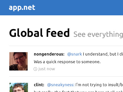
What I don't like, is that with such an opportunity for a fresh start, they decide to go with a bunch of shadows, gradients, etc. The internet has enough of that. I like their font (ubuntu). So I did a quick 30 minute redesign with just some blue, white and somewhat balanced typography.
Curious to hear what you would want a social network to look like. Let me know :)


