Infographic

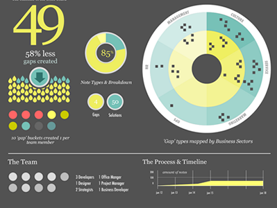

This is part 2 of the info graphic I have been working on, it is the 'after' of the before and after series, I used a darker color and I think it allows the negative space to feel more comfortable, what do you think?
This is part 2 of the info graphic I have been working on, it is the 'after' of the before and after series, I used a darker color and I think it allows the negative space to feel more comfortable, what do you think?


