Apartment Search List View

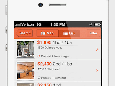


My design of a list view, tabbar and navbar for an apartment search app that a company asked me to put some designs together for. Attached are screenshots of the list scrolled to the top, to the middle and to the bottom as well as a shot showing all scroll levels next to each other. A couple UX/UI things to note:
1) For listings with multiple photos, I added a stacking effect that shows 1 picture frame for 1 photo, 2 frames for 2 photos and 3 frames for 3+ photos.
2) Inspired by Tweetbot, I added a "More Listings" overlay towards the bottom of the list view area, which lets the user know how many more listings they have until reaching the bottom of the list. As such, you'll see this overlay in the "Top" and "Middle" views, but not in the "Bottom" screenshot.
3) For listings that have been posted recently, I made the clock icon orange as a subtle, but noticeable element that power users can pick up on.
If you like this design, please like it by clicking "Like?" up top or tapping L on your keyboard. Also, feel free to follow me on Dribbble and @reply me on Twitter.
What do you think? Comment here or @reply me on Twitter with your feedback. Thanks in advance, Luke


