K

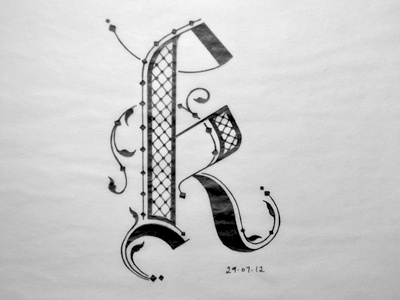
Inspired by black letter and Arabic, I think it's a little bottom heavy though but if I filled in the main stem it wouldn't look as elaborate as it does now. Also the diamonds towards the right the border around it is a little thick maybe if I made the border in the main stem thicker it could help with balance.
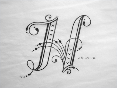
Feedback welcome! :)
Follow me on ig for daily lettering practice @JunoonDesigns