


Red Calendar.app

Full-size: http://cl.ly/IOi3
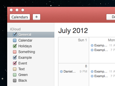
A quick mockup of what Calendar.app could look like if it actually matched the app icon. I did make a version with the metal rings, but did not like it. The rings looks great at an angle on the app icon, but from a straight-on perspective it feels awkward.
Also, thank you @Manolo Sañudo for the glyphs for Search and Full-Screen. Made the mockup process a little faster.


