Clear Contrast
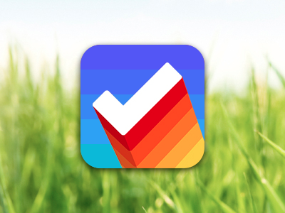
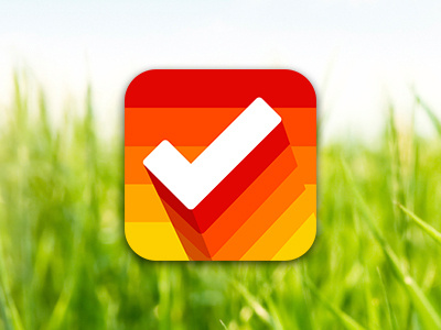
I absolutely love Clear - I use it every single day. I've tried all the themes (including the gift theme, which I just found out about today), but my favorite is Heat Map for sure. I like the menu's blue colors, but the warm colors in the list really look awesome. So, I figured the juxtaposition of the two color palettes would contrast nicely and really bring the check forward.
Realmac - you guys are fantastic. Keep up the insanely great work!